
Plastic Bottle Closures: Can Easy-to-Open Feel Premium?

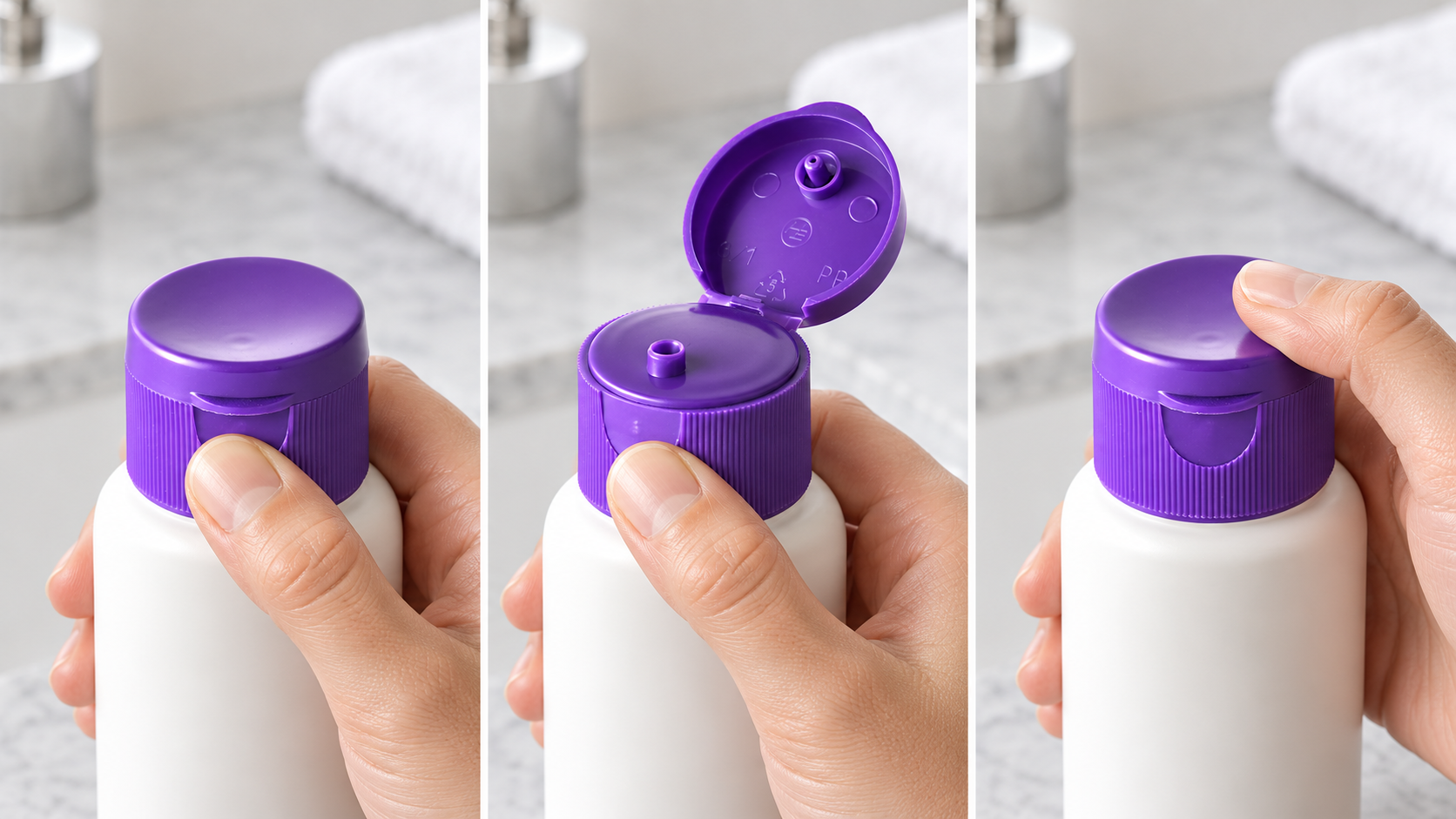
A closure can look beautiful on a shelf and still disappoint in the hand. Here is how beauty brands can make opening, dispensing, and closing feel both effortless and intentional.
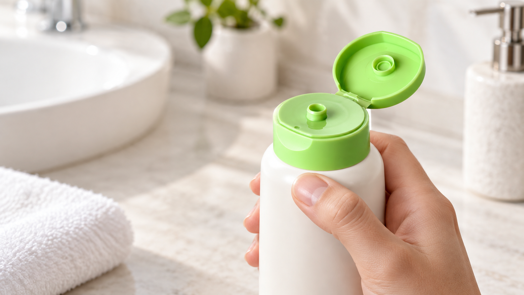
A considered opening action can be as memorable as the bottle’s silhouette.
Think about the last time a beauty bottle felt expensive. You may remember its weight, color, or finish. But you probably also remember the moment you opened it: where your thumb landed, how the lid moved, whether it stayed open, and whether the product came out cleanly. Plastic bottle closures are part of that experience, even when they are nearly invisible in the brand campaign.
Now imagine the opposite. A customer has wet hands and one hand full of shampoo. The bottle looks refined, but the cap needs a fingernail to lift. They squeeze, too much product comes out, and the lid refuses to close without a second hand. Even beautiful plastic bottle closures can fail this ordinary test. The formula may be excellent. The routine still feels awkward.
So can easy-to-open feel premium? Yes. Ease does not have to look utilitarian, and premium does not have to mean stiff, heavy, or difficult. The strongest closure design makes the right action obvious, gives the hand enough control, and delivers the formula without fuss. This article looks at five details that help brands create that feeling, then offers a simple way to test it with real users.
Why difficult is not the same as premium
Some resistance feels deliberate: a lid that closes decisively, a pump that returns smoothly, or a cap that stays in place during travel. Other resistance simply asks the customer to work harder. It may require a strong pinch, a sharp fingernail, a tight twist, or an uncomfortable angle. Those details are easy to overlook when plastic bottle closures are handled once in a meeting room.
They become harder to ignore after a month of daily use. The person opening the bottle may have wet hands, limited grip strength, long nails, or just a hurried morning. In each case, the closure is doing more than keeping product inside. It is shaping whether the routine feels calm or frustrating.
of general consumers in the Arthritis Foundation's US Ease of Use Study said user-friendly packaging matters when purchasing products.
The 850-person survey covered shoppers of beverage, household, and/or beauty products; this is not a beauty-only statistic. Read the study.
The same study reported that 70% of respondents with arthritis struggled with products requiring twisting or gripping. More than half of consumers surveyed said they would switch brands or pay more for easier-to-use products. These findings do not prove that any one closure design increases sales. They do show that the effort required to use packaging is a real purchasing and repurchasing issue, not a minor design preference.
Premium beauty brands have a useful opportunity here. They can make an opening action feel intentional without making it demanding. With plastic bottle closures, texture, proportion, color, and a clean close can create visual and tactile quality. A customer should not have to choose between that quality and comfort.
Five details that make an easy-to-open closure feel premium
There is no single cap style that wins every use case. The same customer may expect a shampoo bottle to work in a shower, a lotion bottle to dispense beside a sink, and a serum bottle to feel precise on a vanity. The best plastic bottle closures fit those contexts. Rather than starting with a product catalog, start with the five moments the hand actually notices.
1. The first opening makes sense without instructions
A premium interaction begins before the lid moves. The customer should see or feel where to press, lift, or turn. A small thumb landing area, a distinct edge, or a clear visual break can communicate the action. If someone rotates a bottle several times looking for the opening point, the design has already interrupted the ritual.
This does not require an oversized tab or a loud visual cue. Subtle geometry can be enough. When reviewing plastic bottle closures, the question for a brand team is simple: can a person unfamiliar with the package open it on the first attempt, without studying the cap or reading a label?
2. The grip works in the room where the product lives
Packaging is often reviewed with dry hands at a table. A body wash may spend its life in a wet shower. A hand cream may be used immediately after washing. A hair treatment may be opened while the other hand holds a brush. The grip that feels fine in an office can feel slippery or too small in those settings.
Surface texture and cap proportions can help, but they should be judged in context. A matte finish may support the visual language of a premium brand; it does not automatically make plastic bottle closures easier to handle. Try the exact bottle, filled with the intended formula, in the environment where customers will use it.
3. Closing feels certain, not strenuous
Users need to know when a package is closed. A clear stopping point or tactile response can provide confidence without demanding excessive force. That distinction matters when a bottle goes back into a cabinet, travel bag, or parcel. An uncertain close makes people check twice; a stiff close makes them push harder than they want to.
It is worth observing both opening and closing. Plastic bottle closures that are easy to open but awkward to reseal have only solved half the experience. The desired action should feel repeatable, not like a careful maneuver that happens to work once.
4. Dispensing is controlled and clean
The best opening action can be undone by messy dispensing. A generous opening may make a thick conditioner easy to squeeze, but a thin product may escape too quickly through the same orifice. A small outlet may control a liquid yet frustrate someone using a higher-viscosity formula. Premium, in this moment, often means the amount delivered matches the amount the user intended.
Test plastic bottle closures with the finished formula, not only with water. Observe the first use, the middle of the pack, and the last practical doses. Check whether product collects around the opening and whether the consumer can close it without wiping the cap. For targeted treatments, HB’s 20/410 nozzle cap illustrates a different dispensing approach: a directed stream rather than a broad pour. The right choice depends on the actual formula and application.
5. The finish belongs to the brand
Ease should not look like an afterthought bolted onto a beautiful bottle. The closure’s shape, color, finish, and scale can reinforce a product line. A quiet matte surface may suit a restrained skincare identity. A controlled two-tone detail may help a range feel recognizable. A cap that sits neatly on the bottle can make the whole package look resolved.
These decisions are not just decoration. The visual design of plastic bottle closures can make the opening point easier to find. A color contrast may improve orientation; a familiar cap silhouette may lower the effort of learning a new product. Aptar Beauty’s 2026 white-paper announcement describes custom primary packaging as a way to connect brand differentiation with more inclusive product experiences. HB buyers can explore the same question through samples and controlled design choices, without assuming every custom finish improves usability.
Plastic bottle closures should work for more than one kind of hand
Inclusive design is sometimes described as a special feature for a small group. In practice, many of the conditions that make packaging difficult are ordinary and temporary: wet fingers, a sore wrist, a sleeping baby in one arm, or a rushed routine. Designing for those moments can make a product more comfortable for everyone.
That does not mean every bottle can be operated identically by every person. It means a brand can examine the avoidable barriers it controls. Is there enough area to grip? Does the opening require a nail? Can the user see or feel how to align the closure? Does the bottle remain stable when one hand is doing the work? Is the cap harder to close after product gets on it?
Brands should be careful with the language they use. An easy-opening prototype is not automatically an “accessible” or arthritis-certified product. Such claims need appropriate user testing and, where relevant, independent evaluation. The value of this approach is to invite more people into the testing process before a packaging decision becomes expensive to change.
The five-minute bathroom test for a closure concept
A sample review does not need to begin with a laboratory instrument. Start by observing ordinary actions with the proposed bottle, cap, and formula. Ask several people who did not help select the package to use it. Give them no opening instructions. Watch for hesitation, readjustment, spills, repeated attempts, and comments that reveal how the package feels.
The following matrix is an editorial starting point for internal comparison, not a certified accessibility or performance standard. Brands should still run the relevant compatibility, leakage, transport, and user tests for their product.
| Moment to test | What to observe | What it tells the brand |
|---|---|---|
| First opening, dry hands | Can a new user find the opening point without help? | Clarity of the first impression |
| Opening with damp hands | Does grip change or does the hand slip? | Fit with bathroom use |
| One-handed use | Can the bottle remain stable while the closure moves? | Ease during a real routine |
| Dispensing the formula | Is the dose controlled, and does product collect at the outlet? | Sense of precision and cleanliness |
| Closing after use | Can users tell it is closed without excessive force? | Confidence and repeatability |
Use the intended bottle and filled formula. Document the participants, conditions, and issues instead of treating one successful demonstration as validation.
In a useful session, the team records what happened rather than asking only whether someone “liked” a cap. Did they use their thumb or a fingernail? Did they change hands? Did they wipe the outlet before closing? Did they reach for a towel? Those observations tell you what to improve, while subjective impressions tell you whether the change still fits the brand.
When testing plastic bottle closures, compare more than one candidate. Keep the bottle and formula constant when possible so that the opening action is the main variable. If the candidates use different neck finishes or require different bottles, note that difference instead of treating the results as a direct comparison. A small, honest test is more useful than an elegant presentation built around the wrong assumptions.
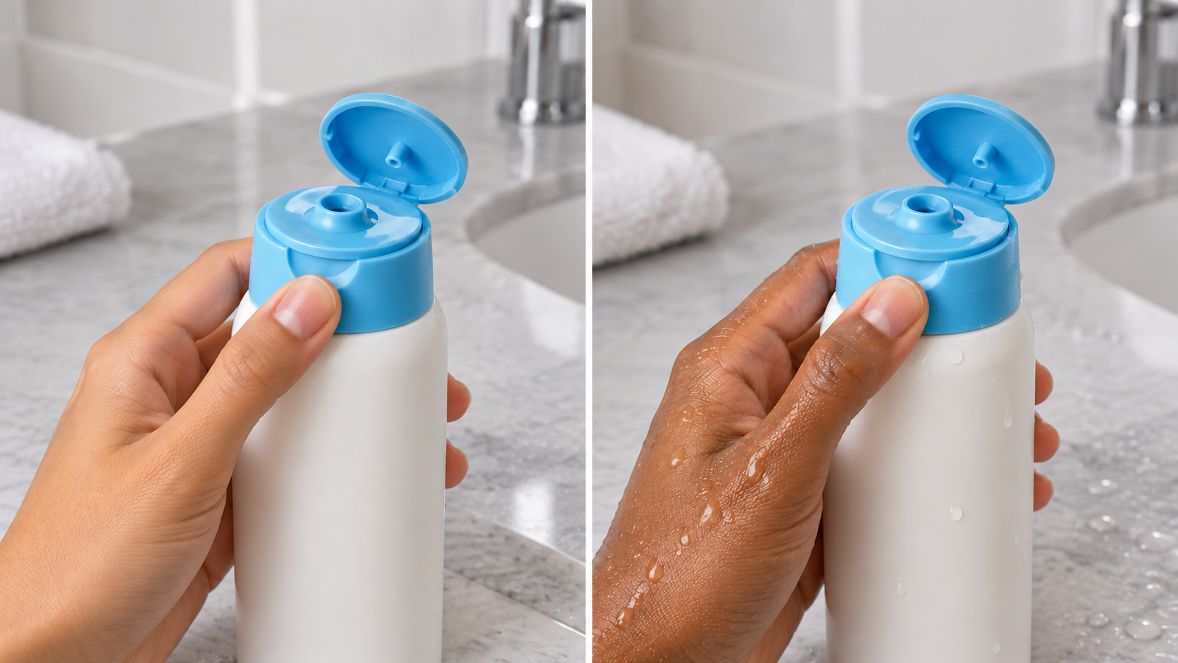
Real hands and real conditions reveal what a product-only photograph cannot.
From design intention to a physical sample
Once a brand understands the experience it wants, the specification conversation becomes much better. Instead of asking for “premium plastic bottle closures,” the team can describe the intended opening action, use environment, formula behavior, visual finish, bottle neck, and target user. That gives a closure supplier something testable.
HB Packaging’s 24/410 matte flip-top cap is one example of a product where finish, opening action, orifice size, and bottle compatibility can be discussed together. For a targeted application, a nozzle cap may be a better starting point. These are examples to sample and evaluate, not pre-approved answers for every formula or user.
Ask for physical samples on the intended bottle. Check the neck finish drawing, fill the package with the real formula, and observe use over time. A closure that feels appealing once, empty, on a table may behave differently when filled, damp, inverted, or repeatedly opened. Where a custom color, finish, or mold is being considered, settle the functional action first and then tune the aesthetic details around it.
If the team needs a broader introduction to formats, HB’s existing flip-top, disc-top, and push-pull comparison explains the basic mechanisms. This article asks a different question: how does the chosen mechanism feel in the customer’s daily routine?
Premium should feel effortless
So, can easy-to-open feel premium? Absolutely. The opening point can be intuitive, the grip can work where the product is used, and the close can feel reassuring without being stubborn. Controlled dispensing and coherent visual design complete the experience.
For beauty brands, the next step is not to declare one closure universally better. It is to define the routine, compare real samples, and listen to the hands that will use the product. The most memorable packaging often makes that effort disappear.
Frequently Asked Questions:
Q Are flip-top caps always easier to open than screw caps?
Q Does a matte finish make a closure easier to grip?
Q What should a beauty brand test before choosing a closure?
Q Can a brand call an easy-opening closure accessible?
Test the experience before you commit
Share your bottle neck finish, formula type, use setting, and desired opening action. HB Packaging can help identify closure samples to evaluate with your own users.
Catch the packaging decisions your competitors are already making.
One practical brief each month on closure specs, compliance shifts and sourcing mistakes, before they turn into samples you have to redo.