Why Pantone Colors Shift on Molded Plastic Caps (and How to Approve Color Correctly)

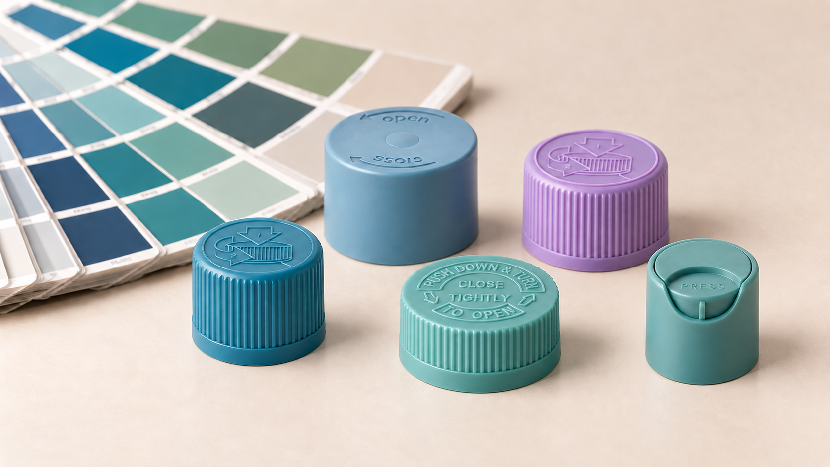
You send your supplier a Pantone code. The sample arrives, and the cap doesn’t look quite like the swatch. A second cap in a different material looks different again.
This is one of the most common surprises in Pantone color matching on plastic caps, and it usually isn’t a mistake. Pantone is a color target, not a complete description of how a molded part will look. Resin, finish, wall thickness and lighting all change how a color is perceived.
This guide explains why Pantone colors shift on molded plastic and how to approve custom cap color before mass production.
The short answer
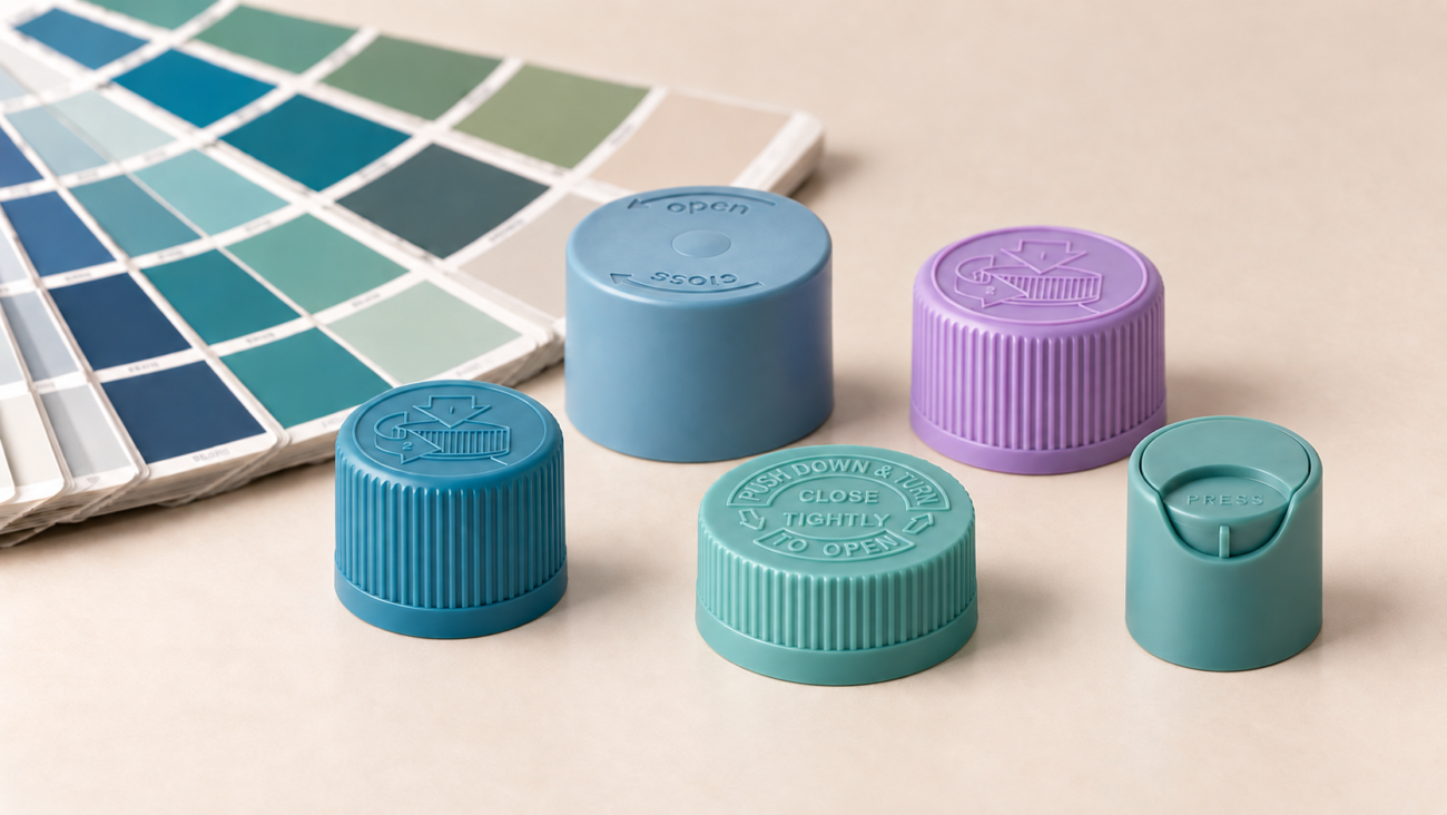
A Pantone reference defines a color on a standardized surface. A molded plastic cap is a different surface: a specific resin, colorant system, texture and geometry, viewed under whatever light the buyer happens to use. Because those variables change how color is perceived, the same Pantone code can look different on two plastic caps. For this reason, color should be approved on a physical molded sample in the actual material and finish, not only on a screen or paper chip.
Why the same Pantone looks different on two plastic caps
1. Resin base color
Plastic resins are not all the same starting color. Some are naturally clear, some slightly milky, and some have a faint yellow or off-white tone. Colorant is added to that base, so the base affects the final shade. A light, bright color is the most sensitive to this.
2. PCR content
Post-consumer recycled (PCR) resin often carries a slight natural tint and can vary from batch to batch. If you are moving toward more sustainable packaging, expect color to need extra attention, especially for light or pastel shades. See our guide to EU PPWR requirements for plastic caps for the regulatory side of recycled content.
3. Translucent vs. opaque
An opaque cap hides what is behind it. A translucent cap lets light pass through, so the color you see depends on the material’s depth, the light, and what is behind or inside the part. A translucent cap can look noticeably different from an opaque cap in the same Pantone.
4. Wall thickness
In a molded part, thicker areas generally look deeper and thinner areas lighter, especially with translucent or lighter colors. A cap with varying wall thickness can show subtle shade differences across the part.
5. Gloss vs. matte texture
A glossy surface reflects light in a focused way, so color tends to look deeper and richer. A matte or textured surface scatters light, so the same color tends to look softer and lighter. The same pigment can read as two different shades depending on finish.
6. Lighting and viewing conditions
Two colors can match under one light source and look different under another. This effect, called metamerism, is why a cap approved under office lighting can look different in a store, a photo studio or daylight. Always compare samples under the same, neutral lighting.
Why a screen or paper chip isn’t enough for approval
Screens emit light, and paper chips reflect it from a printed, coated surface. Neither behaves like injection-molded plastic. A screen approval or paper chip comparison tells you what you’re aiming for, but it can’t show you what the molded part will look like. A physical sample in the target material and finish can.
How to approve custom cap color: a practical process
- Define the target. Provide the Pantone reference (and a physical swatch if you have one).
- Specify the material and finish. Name the target resin (for example PP or PE), whether it is opaque or translucent, and whether it is matte or glossy.
- Flag special requirements. Tell your supplier if the cap must include PCR content, pair with a specific bottle or component, or match another part of your packaging.
- Review a physical molded sample. Evaluate it under neutral lighting, next to your other components and, ideally, in the environment where it will be sold.
- Approve before mass production. When color is critical, sign off on a physical sample first. This avoids costly surprises on a full order.
For the typical number of sample rounds and lead time, we can advise per project. If your project also needs a custom cap shape or size, see how custom bottle caps are developed.
What to send us for a color-match request
To start a custom color project with HB Packaging, it helps to include:
- The Pantone reference (and a physical swatch if available)
- Cap style and neck size, with the product page or drawing if you have one. See our bottle cap neck size guide, our dispensing closure guide and our lotion pump cap guide.
- Target resin, finish (matte or gloss) and opaque or translucent preference
- Whether PCR content is required
- Estimated order quantity and timeline
Browse our plastic and silicone bottle caps to find the cap style for your project.
Frequently Asked Questions
Q Can plastic caps match Pantone exactly?
Q Why does my cap look different from the Pantone chip?
Q Does PCR plastic change color?
Q Is a matte cap a different color from a glossy cap in the same Pantone?
Q What should I do before approving a custom color for mass production?
Start your custom color project
Catch the packaging decisions your competitors are already making.
One practical brief each month on closure specs, compliance shifts and sourcing mistakes, before they turn into samples you have to redo.